

Figure 17A. I arrived in Florida just as ideas about data as [from last one]. And once I started seeing the data around me, I couldn't stop.
Since we don't have leaves that change colour, manatees arriving to town was my indicator (or signal) that it was officially "winter".

Figure 17B. Tracking the amount of trash found on the beach at various points in the day is one way to measure the level of pollutants.

Figure 17C. At a certain point, if the trash piles up too high, beach management staff will become overwhelmed and scramble to complete the task. Any sort of metric system would not be helpful then.
.
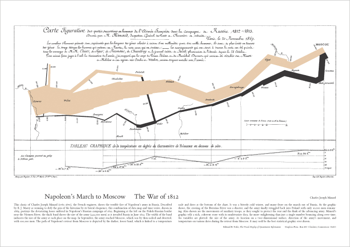
Figure 17D. Information design is the study of how information is presented. The way information is presented affects the way that people interpret that information. As such, there are better and worse ways to present information so that everyone understands you.
This example is considered to be the world's earliest data visualisations and one of the best statistical representations. It shows 6 variables at once. The way that the data is displayed here highlights the casualties suffered in comparison to the larger unit. Immediately conveying a story to those who understand its meanings. This graphic was an optimal way for representing this data.

Figure 17E. In this example, Nightingale wanted to receive increased funding for her nurses. Unable to secure the funding, she created this visualisation of injuries and deaths in comparison to avoidable deaths. The visual it produces is quite stark and provides both the evidence and the argument in favor of the shift.
In these ways, data, whether it be the number of manatees or trash you see, or the number of battlefield wounds nts, that data tells a story and we geet to decide how to tell that story.